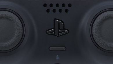
Sony has finally released a batch of images of the new Playstation 4 controller. Since they decided to tease us by not showing the console at last night’s event, we’re just going to have to make do with this for a while.
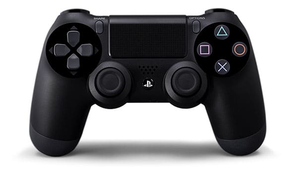
The most obvious difference from the Dualshock 3 is the PS Vita-styled touchpad between the face buttons and d-pad. We’re not sure what this touch pad will be used for though. Also changed is the d-pad, which is now a mix of the PS3 and the Vita’s d-pads. There’s also a standard 3.5mm headphone jack under the PS button.
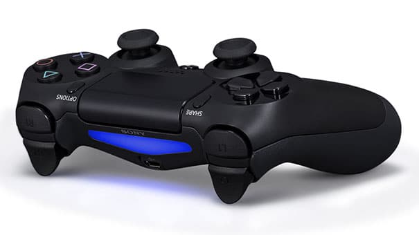
Notice the Share and Options buttons on either side of the the touchpad. The Share button can be used to record and broadcast gameplay videos, but we’re not sure what the Options button does. The bumpers and triggers are also drastically different. R1 and L1 are now larger, while R2 and L2 are concave for better grip.
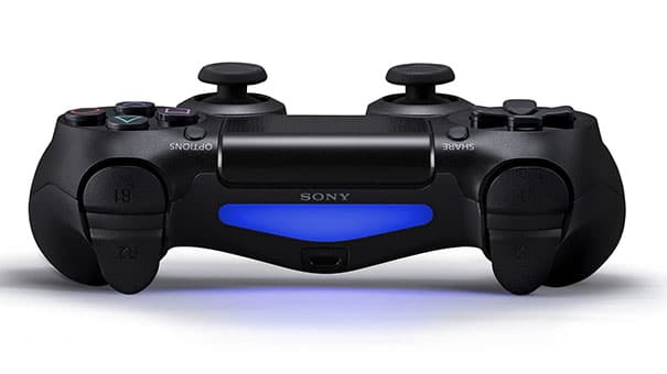
The light strip between the triggers replaces the four LEDs that indicated the controller number on the Dualshock 3. Like the Move controller, the light bar will light up in different colours to denote the controller number.
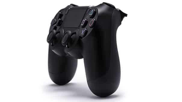
The Dualshock 4 has a far more ergonomic looking design than its predecessor. The design is curvier and seems larger than the Dualshock 3, but still smaller than the Xbox 360 controller. The raised edges of the analogue sticks have been a requested feature, and will go a long way towards ensuring that your thumbs don’t slip off them during long play sessions.

The PS4 Eye replaces the PS3’s PS Eye camera. The new sensor seems to pack in two cameras and is used to track the location and movements of the Dualshock 4 controller as well as the Move controller.
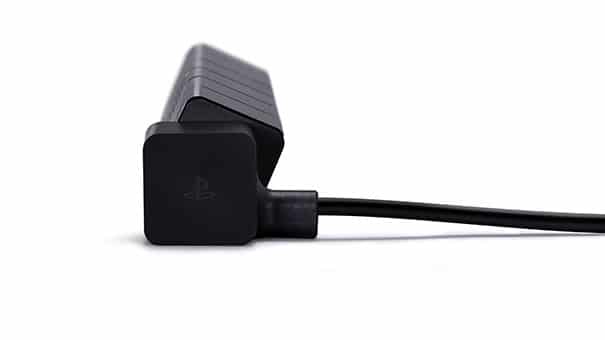
The angle of the PS4 Eye can be adjusted depending on the height at which it is placed.
What do you think about the new controller? Improvement over the Dualshock 3?
